Here are two questions I’m frequently asked during the various keynote speeches I present to trade groups around the country:
- “How do you make sure clients don’t miss the run-ups in the market?”
- “How do you protect clients from another financial disaster year like 2008?”
Frankly those are two very tough questions that would cause most financial advisors to quickly turn and run.
Let’s face it. In 2008 the markets had a catastrophic meltdown that continued into the first quarter of 2009, with upwards of 25 percent added on the downside.
Then the markets turned on a dime and began moving up very quickly. So, did you know it was time to get back in?
If you’ve been keeping up with this hugely helpful advice column you’re currently enjoying, you may have detected that the underlying theme of my firm’s overall investing approach is supported by the concept of Relative Strength.
Relative strength is simply a method we use to depict which charts are moving up or dropping down in relation to the market or peer industries. We can run tests pitting one chart against another to measure relative strength. It’s essentially a big arm-wrestling match, where the winner displays superior relative strength over its adversary.
So how does relative strength prevent you from missing market run-ups?
One of the long-term indicators my firm relies heavily on measures the relative strength of the Standard & Poor’s 500 vs. the Total Bond market. This indicator will tell you whether it’s better to be in stocks or bonds.
It is as simple as that.
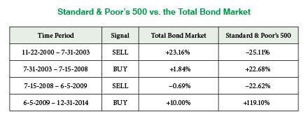
As an example, a glance at the 2008-2009 time frame will demonstrate the value of relative strength (see chart below). The relative strength chart of the Standard & Poor’s 500 vs. the Total Bond market gave a “sell” signal in July 2008. When that happened, it told us that bonds are favored over stocks at that particular time. And as we well know, July 2008 was a really good time to get out of the stock market.
That’s great, but how does this chart let us know when it’s time to get back into the market?
Well, one year later in July 2009, the chart changed and flashed a “buy” signal. This indicated that it was safe to get back into the market. Looking back we know the new structural bull market began in March 2009.
Please remember that relative strength will never get you in at the exact top or get you out at the exact bottom. But relative strength does give you a pretty accurate picture that you can respond to.
Looking back to July 2009, it was extremely difficult to pull the trigger and jump back into the market. But when you have indicators like these it’s a little bit easier to see when the smoke has cleared.
Stacking the Odds
In managing your money all you really want to do is stack the odds in your favor. Now, these indicators are not entirely perfect and mistakes do occur. But they certainly can help you improve your odds and move your portfolio forward.
So you’re probably wondering, “Roger, wasn’t 2008-2009 just a once in a lifetime phenomenon?”
To which I’ll answer, “Nope.” This indicator works in any market environment. To paint a bigger picture let’s take a quick look at the past 15 years.
In November 2000 this indicator gave a sell signal which continued until July 2003. During this time the Standard & Poor’s 500 returned –25.11 percent and the Total Bond market +23.16 percent.
Think about that for a moment. By simply knowing whether to be in stocks or bonds at that time would have had a dramatic effect on your portfolio. Sure, there was a lot going on, from the dot-com bubble bursting to 9/11 and the subsequent invasion of Afghanistan. But in looking back, this indicator was spot on.
In July 2003 the chart changed, signaling it was time to be in stocks until July of 2008. The return was only a little over four percent annual, but better than the Total Bond market. The next signal moved us out of stocks just before the meltdown began. The Standard & Poor’s 500 dropped more than 40 percent, only to recover half. The Total Bond market was about flat.
Since July 2009 this indicator has been on a buy signal, once again hitting the bull’s eye. The Standard & Poor’s 500 has more than doubled and the Total Bond market has returned a respectable 10 percent.
Relative strength can help you answer the tough questions, even though it will never get you in at the very bottom or out at the very top. But it does give you an accurate illustration of strong market trends and can become a valuable tool in your investment arsenal.


